


Creating a successful multifamily website can seem like a daunting task. There are a wide variety of items to keep in mind and lots of terminology to keep track of. But don’t worry. That’s what Digible’s for!
We pared down all those endless lists to the top 14 tips you absolutely need to know when building your multifamily website.
Design & User Interface for the Best Performing Multifamily Industry Website
Sites with bad or outdated designs or UI can frustrate your prospects and threaten your digital success. Follow these 3 tips to keep your users happy:

1. Break up copy with strong visuals
Investing in professional photography and videography is one of the easiest ways to ensure a beautiful multifamily website. Renderings are all well and good for properties that are still in development. But once your place is ready to lease? Well, then prospective renters want to see what it actually looks like. And nothing does that better than strong photography. As an added bonus, pictures and videos can help break up your copy, making it more appealing and easier to digest.
2. Ditch sliders and carousels
While they may look super snazzy and eye-catching, rotating modules actually reduce the chances of users seeing your important content. Very few website visitors will sit and watch a rotating slider all the way through, after all. Carousels and sliders also tend to slow down page speed, which (as we all know) is a major no-no for SEO.

3. Think mobile first
Did you know that 4 in 10 renters use their phones to search for apartments? It’s true. That percentage has been steadily increasing over the past several years and will continue to grow in the years to come. That’s why it’s essential to have a website that looks and functions just as well on mobile devices as it does on desktops and laptops. (Source: AAOA)
Strong Copy
What you put on a page is just as important as how it’s designed. Maybe even more so. Website copy is an effective tool for improving brand awareness, search visibility, site traffic, and conversion rates. It also provides prospects with valuable information about why they should rent from you. Spoiler alert: It’s ‘cause you’re awesome.
4. Write effective headers
Your headers should make sense for both the humans who read them and the search engines that crawl them. That means you should:
- Limit yourself to one H1 per page
- Organize all headers into a stylized hierarchy—i.e., flow from an H1 to an H2 to an H3, and so on, as you scroll down the page
- Use location-specific keywords and ditch generic headers like ‘Amenities’
- Keep headers within 20-70 characters
5. Make call to actions (CTAs) concise and actionable
CTAs should always be clear and descriptive. It should be completely obvious what action should be taken and/or what the user will achieve by clicking. For example, a button should read “Complete Your Application” or “Apply Today,” NOT just “Application.” Here are a few other tips:
- The main CTA should be found in three seconds or less (here’s a good example)
- Keep CTAs to four words or less
- Create urgency with time-based words like “Apply Now” or “Schedule a Tour Today” or words that imply scarcity like “limited inventory” or “last chance”
6. Watch your word count
Web pages need to include juuust the right amount of text—not too much and not too little. A low word count will hurt your SEO. And a high word count will overwhelm your users. The Goldilocks-level sweet spot is typically around 600-700 words per page.

7. Add dynamic content such as blog posts
Including a blog and/or posting articles on a regular basis is one of the best ways to improve your SEO, increase your traffic, and establish your property as a thought leader. And the possibilities are endless! Here are just a few topics your prospective renters and current tenants might be into:
- Moving checklist
- Cross-Country Apartment Hunting: What to Know
- Downsizing tips and tricks
- Renewing vs. Signing a New Lease: How to Decide
- Storage Ideas for Studio Apartments
User Experience (UX)
Your website should be simple and easy to use. Dare we even say enjoyable? Renters should be able to find exactly what they’re looking for…and maybe even a few helpful things they weren’t expecting to discover. That means following these simple rules:
8. Keep your navigation menu tight
Your menu should have no more than five parent items. Seven items TOPS. And the fewer options, the better. Otherwise, users will find it too difficult to navigate.

9. Don’t make users search for information
One of the most frustrating web experiences is being forced to navigate a site that’s not intuitive. That’s why you should always:
- Make your address and phone number visible on every page, ideally in the header or footer (or both!). Hyperlink phone numbers so users can ‘click to call’. Be sure to hyperlink addresses too, so users can visit your Google Business Profile (not just your generic Google map address).
- Add hyperlinks to other internal pages so that users don’t have to dig to find what they’re looking for.
- Include recognizable pages, such as “Floor Plans,” “Amenities,”, “Location”, “Contact,” etc. There’s no need to get creative with your naming conventions here, people. Keep it simple and easy to identify.
10. Include videos
Videography provides users with a level of information and trust in your property that simply cannot be achieved with text and photos alone. Plus, websites with relevant video content have been proven to increase site traffic and conversions, as well as improve your site’s location on Google’s search engine results page.
11. Use pop-ups wisely
Pop-ups should take up less than 15% of the screen, should never cover any content, and should be easy to dismiss. It’s also a good idea to time your pop-ups so that they appear at the end of a page, rather than assaulting users the moment they open your site. (Source: Search Engine Journal)
Website Optimization
Optimization improves your website’s efficiency, security, and usability, helping both you AND your users. That’s what we in the industry call a win-win, folks. Here are a few final tips to keep in mind as you look to get your optimization on.
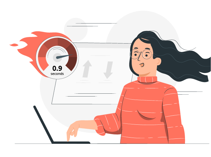
12. The faster the page speed, the better
25% of people abandon websites that take more than four seconds to load. As if that’s not bad enough, Google also punishes poorly optimized websites by pushing them lower in the SERPs. That’s why you need to take a page from Maverick’s book and channel the need…the need for speed. Page speed is affected by things like your hosting plan, your server size and location, and the amount of traffic you get to your site. Aesthetic additions like images, videos, animations, and fonts can also impact your speed. Use industry tools like Google Page Speed Insights to make sure that none of these items are slowing you down.
13. Use forms, not email addresses
Plain text email addresses can leave inboxes and mail servers vulnerable to attack. Best practices dictate that you send users to a contact form on your website, rather than an email. If for some reason you can’t get around the issue and an email address must be included, make sure it’s encoded properly.
14. Adhere to SEO best practices
- Cross-link to other pages on your site (ideally two to four times per page)
- Include outbound links to reliable domains and make sure they always open in a new tab
- Optimize content for keywords (i.e., the words and phrases you want to rank for)
- Use headers (H1-H6) with meaningful content
- Always include meta descriptions, titles, and keywords for any web page. Keywords that include location-specific information are especially helpful for ranking where it matters most.
- Always include alt text on any image
- Utilize structured data such as schema.org
- Don’t forget about microcopy!
Conclusion
Multifamily websites play a crucial role in attracting and retaining residents and driving revenue for your properties. And building them doesn’t need to be as overwhelming as you might think! Simply follow the best practices outlined in this post and you, too, can create a website that’s informative, visually appealing, and effective.
Not sure where to begin? Contact us today to see how we can help!
Want to stay in the loop on Digible’s website services?
We’ll include progress updates and important announcements about our new website product in our monthly e-newsletter. Drop us a line or contact your account manager about our current and future offerings.